Looking for the latest insights? Check out our new post: 25 Must-Haves For Your Website in 2025 to stay ahead of the latest trends and ensure your site is future-proof for the coming year.
After the success of last year’s post about the “22 Must Haves For Your Website in 2022”, we’ve refreshed the content to look ahead to 2023. So here we have the ultimate how-to guide for your website in 23 tips. Read on to find out more and get your questions answered.
1. Mobile-First Design Approach
Do you often wonder how to engage a digital audience? This question remains constant in today’s day and age.
In early 2022 the BBC reported that, on average, people spend 4.8 hours a day (around a third of their waking hours) on their mobile devices. Also, Google has switched to a mobile-first index, so if your website isn’t prepared, it will face the consequences – something no business would want to happen!
Make sure your design is thumb-friendly, which indicates it should be simple to use and intuitive, and it should load pages quickly. You might even be reading this blog on your phone which is why having a mobile-first approach when it comes to design is crucial in 2023.
2. Clear Proposition
When someone comes to your website, you don’t want viewers to have to root around and guess where the information they want is located. People have short attention spans, make sure that you have a clear proposition and a killer one-liner which, in turn, will help to reduce your bounce rate on your home page.
3. Brand Transparency


How to be real online? The phrase ‘people buy from people’ doesn’t just apply to your sales team, who know how to present the best of the business for customers and clients.
Your website should be at the heart of your business, where people can go to find out more about what you do, who you are and what’s important to the business and brand. Whether you have a special focus on team building, use sustainable materials or are a really fun team, adding human touches to the website alongside the professional means your website will stand out and be memorable.
4. Storytelling
In today’s digital world, authenticity is often lacking – everything seems automated in the era of the ChatBot.
Storytelling paves a path for meaningful conversations that resonate with the audience. After all, people buy people, which is why sharing your story and “why you do what you do,” can make a real difference when trying to attract business. Storytelling paves a path for meaningful conversations that resonate with the audience. After all, people buy people, which is why sharing your story and “why you do what you do,” can make a real difference when trying to attract business.
An “About Us” section on your website is a great way to tell your company’s history, talk about your mission, and outline your goals for the future. Visuals such as images and video are your best friend as customers appreciate being able to put a face to the name.
5. Solution-first approach
The visitors to your website want a solution to their problems. Rather than selling services alone, think about how what you provide is going to help them! By combining services with solutions, your potential customers or clients can see clearly how you can help them.

6. Dynamic Content
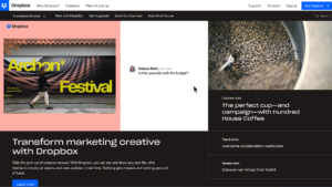
As consumers we want information that is relevant to us and presented in the most convenient and concise way. Websites that display dynamic content generally have the highest engagement and conversion rates. Dynamic content refers to any digital content that changes on the basis of user behaviour, preferences, geo locations and interests. For example, website content can vary depending on whether you’re viewing the same website from London or New York.
Pro Tip: Look into Personyze to assist you with this.
7. Micro-interactions
Smoother UI interactions create a positive emotional effect on the users. To accomplish this website should make use of motion UI design to boost page interactivity. This aids user experience by providing visual feedback of the system status which relates to showcasing the outcome of a particular function.


In simpler terms, displaying what the user should click and what will happen after clicking. This boosts interactivity and prevents errors.
8. Animated cursors
Similar to the previous point, animated cursors also boost interactivity by aiding user experience. There is a very fine line between animated cursors looking gimmicky or boosting website visibility if applied correctly.
9. Design Trends
9.1. White Space

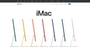
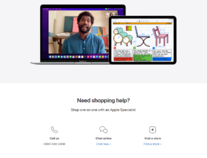

Increased white space in web design is definitely one of the top trends to look out for in 2023. This trend came to light as Apple incorporated blank areas around their new product launches/ blocks of text to help guide the visitor through the flow of the site and encourage them to keep reading. Space is there for a reason, not to be filled!
9.2. Gradients
Unlike the skinny jeans, gradients are finally making a comeback and they’re back with force! Using gradients is a fun and unique way to bring life to websites.


Adova Group has used gradients in a subtle form, giving the object in the middle a 3D look as well.
Pro Tip: Subtle animation can enhance this further
9.3. Split-screen Layout
Adding to the design element is the split-screen layout trend which for now is commonly used in e-commerce sites yet becoming more popular across all sites.

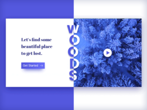
This element is inherently usable in responsive formats and often triggers curiosity.
Pro Tip: You could allow the user to drag the divider to drive more engagement!
10. Accessibility

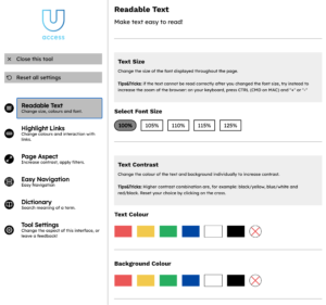
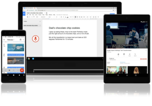

It is high time that we come out of the bubble and burst the myth that accessible websites are just for public sector websites. Accessibility is now becoming an industry standard.
Everyone wants to live in a more inclusive society, so we must make sure that everyone can enjoy the same experiences,regardless of whether they have a disability or not. Websites must be designed and function in a way that is seamless to the user and reflects the need for accessibility. Following the industry standard such as the Web Content Accessibility Guidelines (WCAG) 2.1 is a good start point.
11. Dark mode
For those that don’t know, dark mode is a display setting for user interfaces, such as a smartphone or laptop. It means that, instead of the default dark text showing up against a light screen (known as ‘light mode’), a light colour text (white or grey) is presented against a dark or black screen.
Medium research found that a massive 82.7% of people answered “Yes” to using dark mode in their OS of choice. Not only does it look super sleek, it can also save battery life. In fact, Phonebuff found that it can extend the life of iPhone batteries by up to 30%. Since we know from Google that 40% of transactions are now being carried out on mobile devices, that extra bit of juice might make all the difference for conversions on your website.

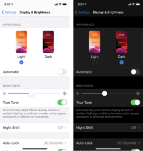
Dark mode used to be an additional feature of some websites and apps but now it’s becoming common practice for any software. Google and Apple have built dark modes into their operating systems, making it an industry standard that users expect. Dark mode reduces eye strain and makes any interface look modern. Add dark mode to your website to improve your user experience.
Pro Tip: This could be implemented as a toggle or automated based on the time of day!
12. The Evolution of SEO
With the turbulent changes in store for search, in general, and web design, SEO itself will likely need to adapt to the changes in its ecosystem. Chief of these is the increased importance of snippets, knowledge cards and graphs, and PAAs (People Also Ask) in Google. Search engines, primarily Google, are also looking toward more non-keyword-based search, like voice. Long-tail keywords and natural language will, thus, be more prioritised over artificially sounding traditional keywords as most people voice search by how they speak, after all. Local content will also become more important in the coming years. 46% of Google searches (HubSpot, 2020) already look for local information, which will be even more critical later on.

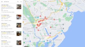
For example, searches with the “near me” or “close by” modifiers have increased ninefold in the last two years.
13. Page Speed
Is it surprising to say that a slow website is the worst enemy of your online business? Probably not. Nothing is worse than entering a fantastic website only to have the page load slowly. Page loading time has always been one of the most important conditions for a well-optimised and converting website. But if you could previously get away with a website that loads in 5 sec or less, now you need to try even harder. The majority of users report they will not stay on a website if the page takes longer than 2 seconds to load. Unless you are Amazon, customers are most likely to switch to another site due to the website page loading slowly. Furthermore, page speed is an important Google ranking factor, so this is worth investing time to get it right.
Pro Tip: run your website through Google’s page speed tool to get a rating!
14. Personalised UX
Thanks to analytics tools, web applications can not only determine who came to the site but also adapt the site for a certain user experience.

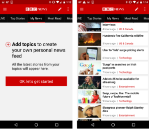
For example, the Apple site adapts the web page to how fast you scroll. So if you were to visit the same site on the same page anonymously, i.e. as if visiting the website for the first time, then you’d get a full presentation of the phone, pricing options and further specifications. In today’s dynamic environment and evolving trends, it is important to realise that all users are not the same and as a business you must consider your returning users and make the experience worthwhile for them. To frame this into simpler terms, websites now are almost like pinterest boards!
15. Landing Pages
Have you heard the saying that your first impression is your last impression? Landing pages are pages set aside for a specific campaign and audience. They are destination pages for each motivated visitor who has clicked a call-to-action and is critical to your conversion success. Landing pages are a must have and often result in a higher conversion rate. Landing pages that integrate to customer relationship management and marketing automation platforms are even better.

Pro Tip: It is important that you are in the driving seat. CMS-managed landing pages allow you to create and update your landing pages as and when required. Also, don’t forget to implement tracking on your landing page so that you can test, hypothesis and pivot. Never stand still!
16. Call to Actions
You must be thinking why such an obvious point is mentioned. The call to action is a key element on a webpage and is obvious, but so often forgotten. Call to Actions simply encourage the visitors to take action rather than merely scrolling past your website.


Retail websites such as Shein, Pretty Little Thing etc. are good examples for prompting viewers with a Call To Action.
Pro Tip: consider adding more passive actions such as “download”, “read”, “sign up” rather than “buy” and “get in touch”.
17. Voice-search on Mobile


Services like Siri and Google Assistant have made people more familiar with the idea of vocalising questions and getting a spoken response from their devices. Amazon’s Alexa has taken this even further, circumventing websites altogether and firing off answers without the need for the information to be represented on a screen. Over the next five years, voice interfaces are set to be adopted as users embrace a more natural, conversational approach to engaging with sites.
This means that voice will need to be considered during the design process, as well as when creating content. Unfortunately, the principles of voice interfaces are completely unique, which poses an obvious challenge to developers. The short, focused, keyword-driven tactics of the SEO age will give way to a time in which long tail search terms are far more powerful. Content strategies will shift to reflect this, with FAQs pulling in visitors more effectively than keyword-packed articles of the past.
This particular “Must Have” focuses on using voice search on mobile devices specifically, which is a nice way to ease your way into the world of voice search. Instead of displaying the typical search bar on your mobile website, you could allow the user to click a button which activates the microphone on their mobile device to allow for a voice search.
Understandably this will take a few years to perfect and implement, but in 2023 you can expect to see voice reshaping the website experience.
18. Chat Bots
Chat bots have been around for quite some time. While Chat Bots aren’t new, they are becoming much more important. Of course, they are here to stay, but to remain competitive online you need to make sure your bots sound more human than they used to. The truth is no one likes chatting to a machine. The more personalised and humanised the conversation is the better.


Test, review the data, evolve & pivot – REPEAT! Learn from the data you gather, learn how user’s respond to your chat bot and then constantly evolve them.
19. Advanced Tracking
Now is the time to advance your tracking. When using advanced tracking, you can employ a new type of tracking to acquire a deeper understanding of visitors rather than tracking the number of users who visit your website, bounce rate, and pages per session, etc. You may gather extra information that you could use to guide your next moves by keeping track of button clicks, interactions, user scrolling distance, and form fills.
Check this out: What’s New In GA4?
Pro Tip: Migrate to Google Analytics 4!
20. Prepare for the Cookieless World
The imminent demise of the browser-based cookies is driving an explosion of innovation across the performance marketing industry and could be one of the best things to happen to the sector. With the industry facing the loss of third-party cookie data from Google, necessity is breeding innovation.
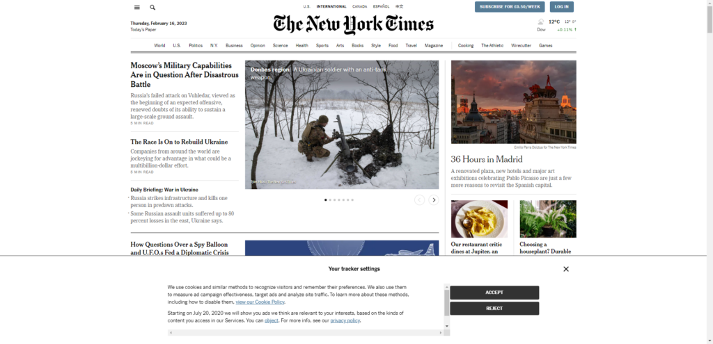

For example: Tracker settings popping up on the New York Times website and giving the users the options to choose essential, non-essential cookies or reject all.
Pro Tip: To overcome the change, you will need to implement server-side cookie tracking. P.s. This is where it gets technical so it is best to speak to a web developer about this!
21. Progressive Lead Forms
A lead form is the main way in which you can connect to your potential customers at the start of your relationship. Encouraging visitors to fill out lead forms is a challenge for many businesses. How can you increase conversions in a lead form?
One way to do it is to make your lead form very short. However, if you need information that can’t be fit in two lines, progressive lead forms are great: just place questions one after the other to encourage users to keep filling in the blanks. Also, each subsequent block of questions should depend on what data your lead already gave you.

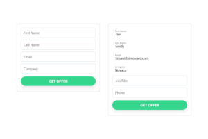
For example, if you already have the name and email address of your lead in your CRM, ask them for their company, phone number, or other data you don’t know. Alternatively, use something like Type Form to break down each element of your forms onto one step.
22. Full-screen Forms
Full-screen forms combine minimalism with interactivity. When a user is immersed in a full screen website, it removes distractions as there are no sidebars, no flickering banners and nothing else distracting the user from the content. Hence, this element of web design allows the user to process information and increases form submissions.


Pro Tip: Content-heavy websites are old fashioned! How ironic, haha!
23. App-like experience

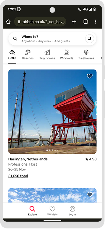
There is a high probability that you are reading this on your phone right now.
The popularity of apps is now moving into websites. A good example of this is the recent switch to dark mode. Users are familiar with the navigation of an app on their phone, hence mobile web design is following suit.
And there you have it; 23 tips for 2023 for your website! We’ve refreshed the content to look ahead to 2024, so read our latest blog on the 24 “Must-Haves” For Your Website in 2024 for the latest trends, insights, tips, and tricks. With a team of experts on hand, why not get in touch with us today for a chat?
