Looking for the latest insights? Check out our new post: 25 Must-Haves For Your Website in 2025 to stay ahead of the latest trends and ensure your site is future-proof for the coming year.
We’re back by popular demand after the success of last year’s post about the “23 must-haves for your website in 2023“. We’ve undertaken extensive research and gathered our insights to bring you the website recommendations for 2024. This blog is divided into four areas, design, content, marketing, and experience so continue reading to find out more about the latest trends and “Must-Haves” for your website in 2024.
Design
1. UX Focused Design
You may have already heard about “UX-focused” design and rightly so! Web designers will start to pay more attention to user experience (UX) design as user expectations rise. Developing websites that are user-friendly and intuitive for all users irrespective of their technical proficiency, will be necessary to achieve this. From the navigation bar, the animation, the headers, and the headlines, everything is structured to engage the visitors in the first few seconds.
Pro Tip: Anticipate the rise of novel trends aimed at enhancing user experience, including AI-driven personalisation, voice-activated navigation, and interactive features to increase engagement.
2. Mobile-First Design
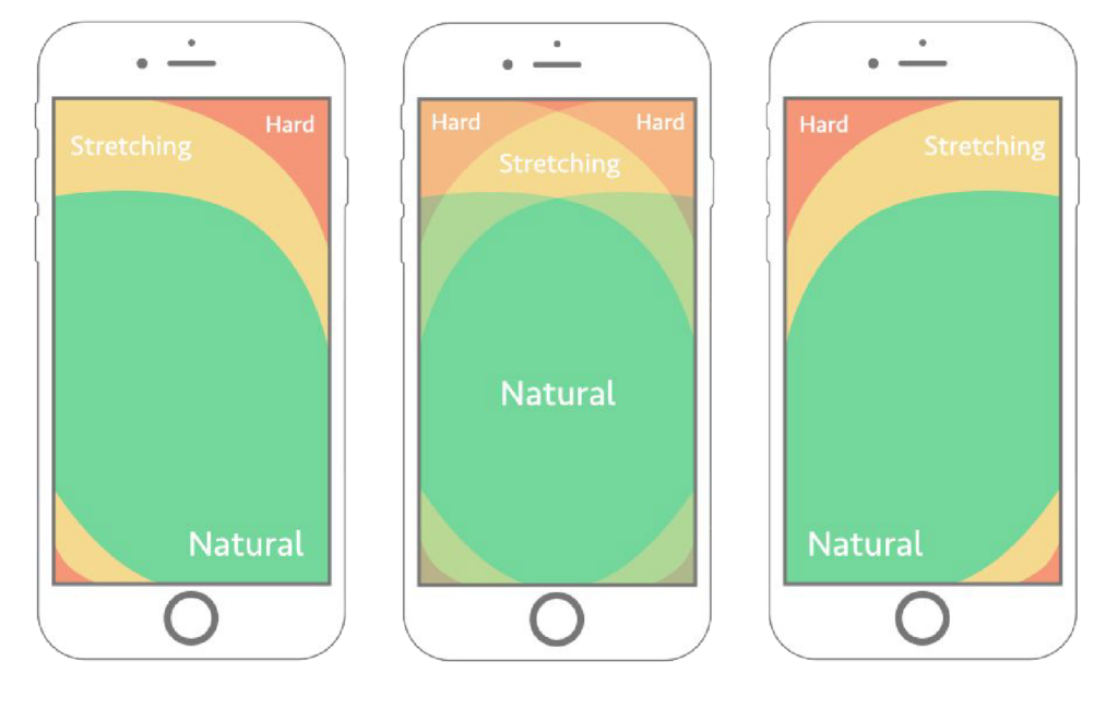
This one shouldn’t surprise anyone! If you’re creating a new website, you might want to think about designing it with a mobile-first approach. With over 60% of all internet users accessing websites on mobile devices rather than desktop computers, it is evident that mobile design is more important than desktop design. It goes without saying that thumb-friendly mobile design is now absolutely necessary. Your website should be simple to use and easy to navigate with just the thumb.
Pro Tip: Google is now a mobile-first index, so taking a mobile-first approach for your website is beneficial for your rankings.
3. Micro-Interactions and Cursors
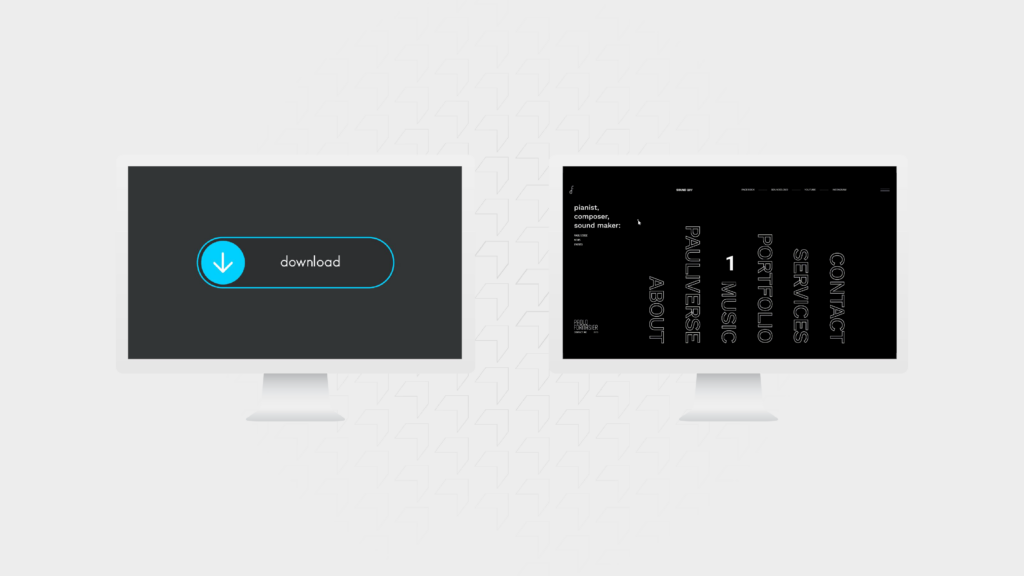
When you click a button, have you ever wondered what will happen next? The use of interactive cursors and micro-interactions can eliminate that feeling of uncertainty. You can maximise your page interactivity by making use of motion UI design and improve the user experience by showing the user what they should click and what will happen after they click.
For example: On our website, the cursor changes to a play icon when you hover over a video and a pause icon when the video is playing.
4. Design Trends
Your website’s design should be current and on-trend to avoid giving users a negative first impression. Who doesn’t want to leave a positive impression when visitors come across your site for the first time?
For instance, gradients are heralding a new era in design trends for 2024, bringing depth, vibrancy, and versatility to web design. If you are building a new website or redesigning an existing one, consider using gradient accents in black and white or highlighting CTAs in vibrant colours. If you want to use a more vibrant colour palette, use gradients in the background for images or entire sections and break it up with white space. In a world where personalisation reigns supreme, gradients provide an adaptable canvas that allows you to tailor unique experiences while maintaining a consistent brand identity.
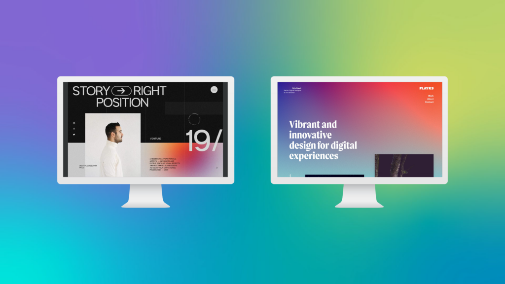
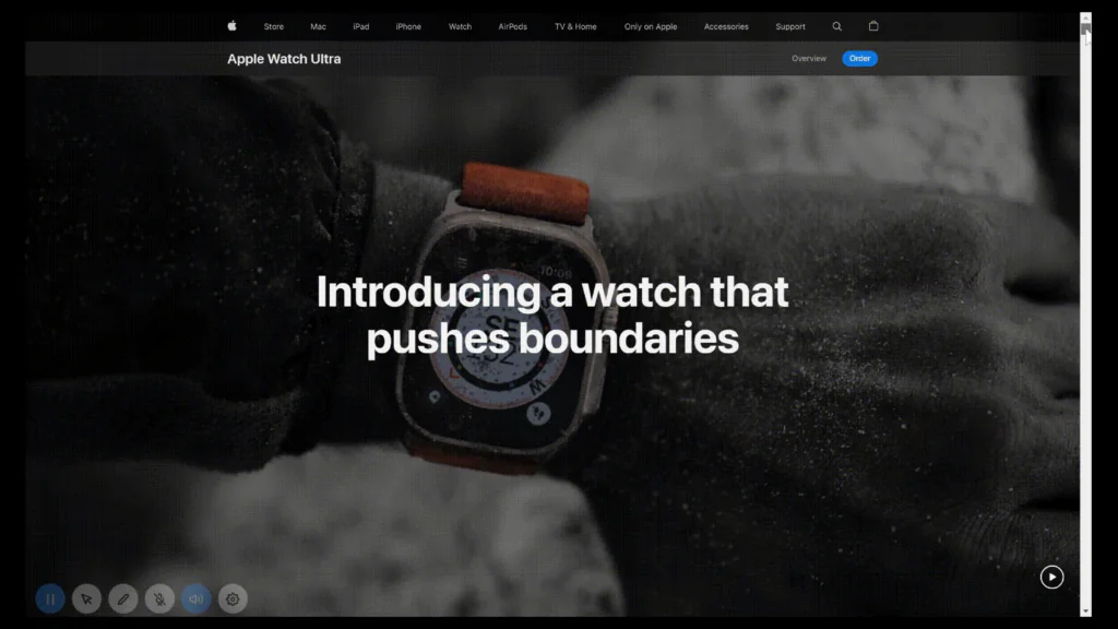
Another element that is set to dominate the design landscape in 2024 is the use of “Oversized” text. Adding large or oversized text across sections of your website creates an ultra-minimalist tone that conveys the necessary information at first glance. You can use thick and bold headings to highlight services, best-selling products, or contact information in addition to the main headline above the fold. It also improves the responsiveness of websites because designers can keep the layout simple and avoid using large visuals on the pages.
5. Accessibility
Accessibility is swiftly becoming a prevailing industry standard and is no longer just a feature for public sector websites.
Websites must be designed in such a way that the user experience is seamless and everyone has the same experience and reflects the need for accessibility. Following industry standards like the Web Content Accessibility Guidelines (WCAG) 2.1 is a good place to start.
6. Dark Mode
For those unfamiliar, dark mode is a display setting for user interfaces such as a smartphone or a laptop. This means that instead of the default dark text appearing against a light screen (known as ‘light mode’), light colour text (white or grey) appears against a dark or black screen.
It is no surprise that 82.7% of people answered “Yes” to using dark mode in their preferred operating system, as per the Medium research.
Google and Apple embedded dark modes into their operating systems, making it an industry standard that users demand. Dark mode not only elevates the design but also minimises eye strain and makes any interface appear more current thus, improving the user experience.
Pro Tip: Include a toggle for the user to switch on and off their mode preference, based on the time of the day.
Content
7. Social Proof
All people want is more evidence to trust one website over another. On many levels, this need is an essential part of developing a relationship by emphasising credibility and trustworthiness. Because the website is frequently the first point of contact between a brand and a customer, trust must begin there.
In today’s world authenticity is paramount, so integrating social proof elements will be more relevant than ever in 2024. Showcasing company milestones/statistics, video testimonials, links to third-party review sites and social media endorsements throughout your website serve as powerful tools in fostering a sense of community and reliability.
8. Personalisation Using AI
AI-powered personalisation is set to redefine design trends in the coming years, revolutionising user experiences by tailoring content to individual preferences.
Analytics tools nowadays can not only discover who visited your site but are also able to adapt the site to a specific user experience as shown in the webinar recording.
Another good example of this is how the Apple website adjusts the web page based on how quickly you scroll.
As customers, we want information that is pertinent to us and presented in the most convenient and concise manner possible. Websites that display personalised content and create tailored experiences, typically have the highest levels of engagement and conversion.
Pro Tip: Check out Personyze to assist you with this.
9. Solution-First Approach
By focusing on addressing the audience’s needs and pain points upfront, businesses establish immediate relevance and value for visitors. This approach aligns closely with user intent, guiding them swiftly toward finding solutions or answers they seek. This user-centric strategy fosters a stronger connection with the audience, building trust and positioning the business as a credible source to meet their needs.
For example, you may not be aware that you require a Performance Marketing campaign, but you will be aware that you require an increase in the number of leads entering your business.
10. Clear Proposition
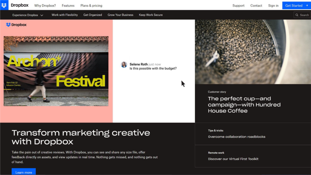
When someone visits your website, you don’t want them to have to dig around to find the information they need. People have limited attention spans, so make sure you have a clear pitch and should be able to summarise what you do in one sentence, which will help to lower your home page bounce rate.
11. Brand Transparency
Brands are waking up to the fact that the first thing visitors desire these days isn’t usually a CTA button pushed in their faces. Many are instead conscientious customers who want to know that the brand values them.
We’ve recently noticed a surge in UX that focuses on exhibiting a brand’s ethics, such as showing the user how products are created or services are provided.
Your website should indicate that your organisation exists both in the digital sphere and in the real world, whether through clear product breakdowns, transparent labelling, or service breakdowns.
12. Interactive Storytelling
With attention spans dwindling and user engagement at a premium, interactive storytelling emerges as a dynamic tool to forge meaningful connections. People care about who they do business with, which is why telling your story and explaining “why you do what you do” can make a big difference when it comes to attracting new clients.
An “About Us” section on your website is an excellent place to discuss your company’s history, mission, and future goals. Consider including information about your founders, current business leaders, and additional team members.
Make users active participants in your journey rather than passive observers as customers will value the ability to put a face to a name.
Marketing
13. Technical SEO
With search engines evolving constantly, technical SEO isn’t merely an option but an absolute necessity. The importance of snippets, knowledge cards and graphs, and PAAs (People Also Ask) in Google is increasing every day. Search engines, particularly Google are also focusing on voice-based search, and as a result, natural language is getting precedence over traditional keywords as most people voice-search by how they speak.
Local content will become increasingly important in the coming years. 46% of Google searches already look for local information, according to HubSpot.
14. Landing Pages
Every single user who has clicked a call-to-action is important for your conversion success. Landing pages play a critical role in your success by acting as targeted entry points designed for specific purposes. They enhance user engagement and provide a seamless user journey by aligning closely with the user intent. If your landing pages interface with marketing automation tools and are CMS-managed then they are updated as and when needed based on the data you collect, therefore, communicating value, capturing attention and overall improving conversion rates.
Pro Tip: Remember to include tracking on your landing page so that you can test, review, and pivot.
15. Intelligent Automation
In the era of “ChatGPT”, as technology advances, we should challenge ourselves to continually seek efficiencies in our processes. Automation and artificial intelligence (AI) allows websites to anticipate users needs and automatically provide relevant information accordingly. AI-driven algorithms not only streamline the design process but also help eliminate all manual tasks, thus, allowing you to define and refine processes and focus more on innovation, creativity and strategic thinking.
16. Call To Actions (CTAs)
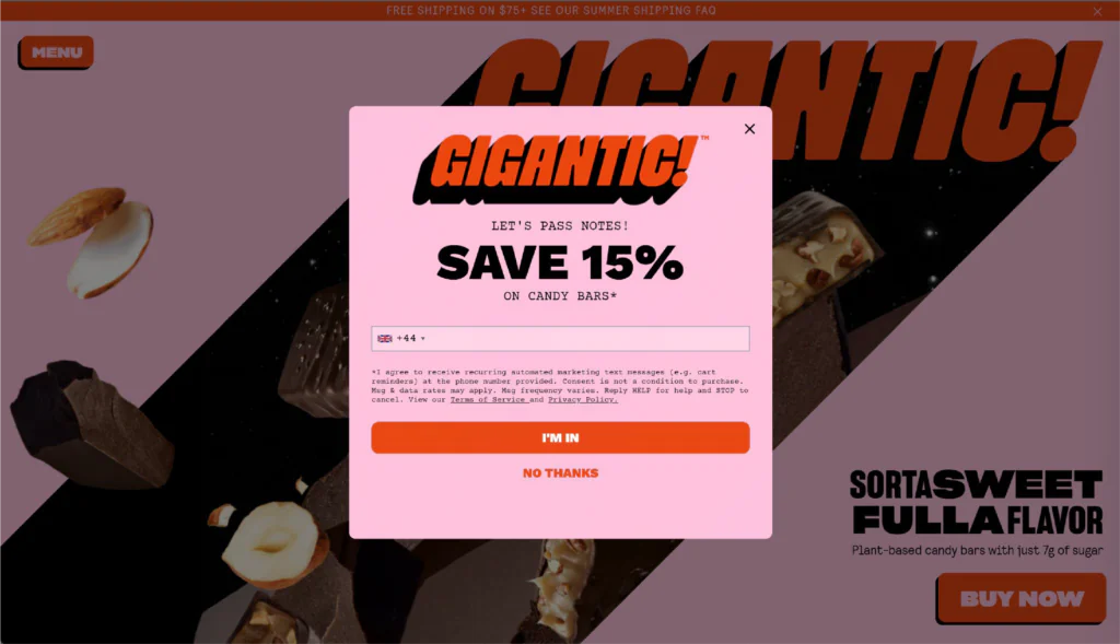
You’re probably wondering what’s the need of mentioning such an obvious point. All of you must be aware that CTAs are important elements on a website but they are also often overlooked. Primary CTAs serve as the pivotal, action-oriented elements guiding visitors towards the most desired and immediate actions, such as “Buy Now,” “Sign Up,” or “Get Started.” However, it is important to also focus on the secondary actions as they complement the primary ones by guiding users towards valuable interactions like “Download”, “Learn More” and “Sign Up”.
Pro Tip: Try the “look away from the monitor” test to analyse your CTAs (check out our webinar recording for more information on this).
17. Advanced Tracking
Do you currently use Google Analytics for tracking on your website?
The majority of businesses will simply add GA4 to their website and call it a day. At the very least, event and, if applicable, eCommerce event tracking should be set up as it provides a more detailed and actionable analysis.
We always recommend including HotJar on your website as it allows you to view video recordings of users navigating your website in order to identify any stumbling blocks. It also includes heatmaps, which show where users’ attention is focused and how far down the page they scroll.
Despite all these efforts, the information gathered won’t be of any use unless you introduce automation and personalisation to your site and make sense of the data.
Pro Tip: We recommend using Google Looker Studio to aggregate this data into a single, easy-to-understand dashboard. You won’t have to piece together data from multiple platforms this way.
18. Third-Party Cookies
The transition away from third-party cookies emerges not merely as a trend but a fundamental shift driving the evolution of user privacy and data governance. Since browsers such as Safari and Firefox prohibit third-party cookies, a quarter of internet users are already available to advertisers who rely on them. This equates to over 15.7 million people in the United Kingdom alone, and a staggering 1.23 billion people globally.
With the industry facing the loss of third-party cookie data from Google Chrome by the middle of 2024, necessity breeds innovation. To prepare for the transition, begin by auditing cookie usage and planning for its impact.
This strategic shift prioritises user privacy while simultaneously challenging designers to innovate in data collecting methods, create trust, and enable personalised experiences without jeopardising user data integrity.
Experience
19. Page Speed
If you thought that you could get away if your website took two seconds to load, think again!
Page loading time has always been a critical aspect in developing a successful and converting website. However, it is important to realise that this is an ongoing process. Even if you got your website to 100% in Google Page Speed, it will most likely decrease over time as your website’s content changes and Google shifts the goalposts.
Pro tip: To rate your website, run it through Google’s page speed tool. We always recommend aiming for at least 80% on mobile and desktop.
20. Voice User Interface (VUI) Design
Google was the first to integrate the voice user interface in their search engine but now, you may have seen the voice icon appear on more and more websites. Virtual assistants and voice search are becoming increasingly popular and to accommodate this, designers will need to modify their strategies.
Voice-controlled elements allow users to navigate search and interact using voice commands and create an intuitive and user-friendly experience. VUI design will change the way users interact with websites, making them more accessible and convenient to a wider audience.
Voice-controlled elements will be added to websites, allowing users to navigate, search, and interact using voice commands. To create intuitive, user-friendly voice experiences, designers will consider natural language processing, conversational interfaces, and audio feedback.
21. ChatBots
The truth is that no one enjoys conversing with a machine. The more personal and human the conversation, the better. However, ChatBots are here to stay and in order to remain competitive online, you must ensure that your ChatBots sound more human than they used to. We recommend that after you’ve implemented a ChatBot, you test it, review the data, evolve and pivot, and then repeat the process! Learn from the data you collect, observe how users interact with your Chat Bot, and then constantly evolve it.
22. Security
This is one of those topics that typically goes unnoticed until your website has been compromised, so don’t wait for it to happen.
As cyber-attacks get more sophisticated, web designers must place a greater emphasis on developing safe websites that protect users’ information. Implementing two-factor authentication systems or more stringent password requirements could be part of this phase. It might also include encrypting data or employing artificial intelligence to detect potential risks.
Pro Tip: If you use WordPress as a CMS, make sure to apply CMS and plugin updates once a month.
23. Full-Screen Forms
Content-heavy websites are old-fashioned. Full-screen forms play a pivotal role in enhancing user experience and increasing engagement. Beyond their minimalistic visual appeal, these forms offer a focused and immersive interaction, capturing undivided attention and guiding users through the input process seamlessly. The expansive layout allows for a clear, uncluttered presentation of fields and prompts, reducing distractions and ensuring ease of navigation, especially on mobile devices.
24. Progressive Lead Forms
Progressive lead forms adapt intelligently to user behaviour, displaying fields and prompts based on individual interactions or previous submissions. By breaking down lengthy forms into smaller, more digestible sections, progressive forms alleviate user fatigue and abandonment, leading to higher completion rates. Their adaptive nature allows for a tailored experience, gradually gathering essential information while keeping users engaged and invested.
Pro Tip: If you want to increase conversions in a lead form, then try making it as short as possible. Use something like Type Form to break down each element of your forms on to one step.
Alright, you’ve got the lowdown on the 24 “must-haves” for your website in 2024. Have you got ideas for your website but are unsure how to bring them to life? We’ve got your back! Get in touch with us today and let our team of experts help you.
