Looking for the latest insights? Check out our new post: 25 Must-Haves For Your Website in 2025 to stay ahead of the latest trends and ensure your site is future-proof for the coming year.
It feels like we’ve blinked, and 2021 is nearly behind us. While we’re looking ahead to 2022, it’s a great time to revisit your website to make sure that it’s up to date and gives potential customers and clients what they need as well as being a virtual shop front for your business.
We’ve put together a list of 22 must-haves for your website in 2022, so grab a cuppa, get comfortable and let’s jump right in.
1 Mobile-First Design
There’s a good chance that you’re reading this on your phone right now or that in the last hour, you’ve read something on your phone. Over 55% of internet usage is from a mobile rather than desktop or PC, meaning that your website needs to reflect this.
Google is also now a mobile-first index, meaning that if your website isn’t ready, it will face the consequences – something no business wants to see! Make sure that your design is thumb-friendly, meaning it’s intuitive and easy to use as well as ensuring that pages load quickly. The simpler, the better!
2 Brand Transparency
People want to know who they’re buying from, what their values are and that they can be trusted. One of the best ways to do this is by providing brand transparency on your website. Showing who you are and how you live and breathe your values and ethics through actions rather than words.
There are many ways you can do this, such as highlighting the sustainable materials used or social media pop-ups that express transparent policies. This shows that your business is aware of the wider implications of the world and its issues.

3 Page Speed
There’s nothing worse than getting on to a great site and then the page loading slowly. People don’t want to wait around and will look elsewhere if a page takes longer than 2-3 seconds to load. Make sure you take a look at optimising your design, optimising your code/imagery and taking those servers up a gear.
4 Clear Message
We’ll tell you an industry secret, one of the most important things you need for your home page is an excellent copywriter. Keeping your message to the point is key; people have shorter attention spans and don’t want to read more than they need to. By having a strong one-liner including everything the user needs to know about your business and offering above the fold, you’re more likely to see conversions.
5 Varying UX
Thanks to the technology available to us and advanced analytics tools, it is now possible to adapt your site for different user experiences, depending on the actions taken of the person browsing.
For example, the Apple website tracks how quickly you browse around the website and scroll down the pages. They will then shorten some of the animated intros to the product pages if they detect you are a ‘quick scroller’. This is a great example of a website understanding that not all users are the same, therefore, the UX one person receives isn’t appropriate for another person.
6 Landing Pages
Your website needs landing pages. These are specific destinations for those who have clicked on a call to action. The people that are clicking those links are already interested and want to know more about your offering; this is where you can lock in leads and really show why they need you. Implementing CMS-managed landing pages allows you to create and update your landing pages as and when required as well as being able to test and tweak as needed for optimal results.
7 Neumorphism
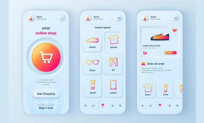
It might be a mouthful to say, but Neumorphism is something that you’re going to want to know about. Put simply; these elements look like they’re connected to the background, creating a shadow effect and have been referred to as “soft UI.”
But, what do you need to know? Within this design, trend elements have a light and dark shadow, rounded edges are a defining element, and subtle borders are an option to improve contrast and make the edges a little sharper.

8 Call to Actions
It might seem obvious to you, but your customers want to know where to go and what to click on. Signposting is a great way to ensure that users have an easy way to find what they need on your site. It’s also a great idea to incorporate multiple CTA types – forms, newsletter sign up, download e-book, call etc. throughout your site and have at least one ‘sticky navigation’ in view at all times.
9 Cookie-Based Tracking
Many people saw the end of browser-based cookies as worrying; however, it’s actually been seen by many as an opportunity for innovation and can be seen as a chance to reset the industry. One of the best ways to overcome change is to implement server-side cookie tracking – but this is when it gets technical! Want to find out how it can help you? Get in touch with one of our developers.
10 Voice-Activated Interface
In a study undertaken by Uberall, over a fifth reported using voice search on a weekly basis. This is a growing trend, particularly with the likes of Alexa and Siri being a part of our everyday lives. This is an emerging trend and one you can get ahead of by implementing it alongside your traditional site search and monitoring its usage.
11 Chat Bots
While Chat Bots aren’t new, they are becoming much more important. People want answers, and they want them fast. By using these bots, you can provide answers to your frequently asked questions while still giving a human voice. The more personalised, the better! Also, don’t forget to evolve as you can see what’s working and what’s not.
12 Motion UI Design
Motion UI design is a way of making your web pages not only look great but also increase interactivity – it also gives users a better experience to guide their time on the site and set their expectations.
13 Accessibility
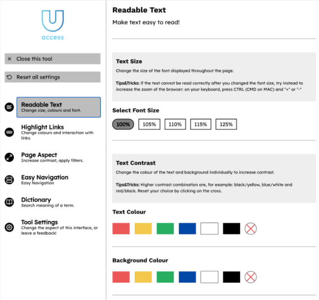
We all want to see a world that is more inclusive, which also means that we need to ensure that everyone can have the same experience, regardless of whether they have a disability or not. Websites need to reflect the need for accessibility and have the functionality so that this is seamless in terms of user experience and design. A good starting point is reading the (WCAG) 2.1 guidelines and considering how you can improve accessibility on your site. We also recommend tools such as YouAccess that can simply plug in to your existing website.

14 Live Collaboration
Collaboration from anywhere has become something that we expect due to the pandemic accelerating working from home – this is true for all kinds of projects, including websites. Using features such as live editing, messaging, tagging, and viewing can make this process smoother. We’re expecting collaborative interfaces to become even bigger in the coming years. In terms of design, the focus should be on exciting colour coding, creative cursor designs and stand-out avatars.
15 Storytelling
People buy from people – fact. Your potential customers and clients want to know about your business and your team. Who are you? Why did you start? Do you have any pictures from when you first started, or perhaps a great team picture? Make sure your About Us page shows people your story and the people behind the business.
Here’s a video to show how we share our story:
16 Advanced Tracking
It’s time to take your tracking to the next level. When using advanced tracking, instead of tracking the number of users that visit your website, bounce rate and pages per session etc you can use a new form of tracking to get better insight into visitors. By tracking button clicks, interactions, how far a user scrolls and form fills you’ll get more data that you can then use to inform your next steps.
17 Augmented Reality
While Augmented Reality (AR) may have once seemed very futuristic, it’s now becoming much more commonplace, particularly within marketing and even in games. What may have been considered a gimmick will be seen more and more within websites to provide a better experience.
This is another piece of technology that has been accelerated by social media in particular – taking note in particular of Snapchat and Instagram. Now, after months of having to stay inside museums, galleries, and more are sharing experiences through AR. It is because of this, UX designers will focus on creating interfaces that are more adaptable such as unobtrusive buttons, dynamic labels and 3D pathing.
18 Dynamic Content
Your content needs to hook people in; think about all the websites they could visit – what makes yours special? By creating content with your target audience in mind that is relevant and easy to consume, you’ll see people coming back for more. What makes it dynamic? The information, visuals and similar elements are dependent on a specific audience and location, giving the user a more personalised experience.
For example, user A from the UK might see a different version of your landing page to user B from the USA. By incorporating dynamic content, you can make your content specific to that user group or location.
And here’s our top tip, check out Personyze, as their platform can be added onto your website in order to provide this functionality.
19 Dark Mode
Dark mode is becoming a lot more popular, and users are increasingly seeing the benefits, including saving battery life as much as 30% , reducing eye strain, and it can also make your site look sleek. Both Apple and Google have incorporated dark mode within their operating systems – making it something that users now expect, and over 80% of respondents found that people were using dark mode in their OS of choice. Get in there early to ensure that customers know you’re keeping your finger on the pulse.
20 Advanced Micro-Interactions
Small design elements can make a big difference, and we expect to see more of them. Working in this way means that actions, such as clicking a button or changing a page, can be animated and give a more interesting user experience. Because the user is causing the animations, transitions etc., developers can be a little more over the top and have some fun with it because the user is the one making the actions happen. It’s a chance to get creative and really show your personality.
21 Progressive Lead Forms
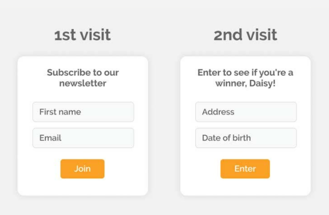
The way we gather data is changing for many reasons, and so is the way that we interact with users to give them a better experience. Progressive lead forms are shorter and get to the point while also getting the information you need. To ask a number of questions, place them one after the other to encourage users to keep filling in the blanks, with each leading on from information they have just given. Keep it short and sweet!

22 Error Page Design
Sometimes things break; that’s just a part of life, so making sure your website’s error page is designed with that in mind is important. It shows that you’ve thought about it in advance rather than an error catching you off guard. You can make sure it matches your branding and your tone of voice – sometimes, you can even have a little fun with it and show your humour.
We hope that you’ve found these 22 “Must Haves” useful and that you can incorporate them on your website soon.
Are you looking to give your website a refresh for 2022? Or perhaps you need a completely new site? Get in touch with our team today , and let’s have a chat.
