We live in an age where it’s becoming increasingly difficult for companies to distinguish themselves from their competitors.
Too often brands opt for a formulaic approach using website templates, generic stock photography and competition sourced logos. This approach has can have a detrimental effect, making your brand look cheap, boring and indistinguishable from your rivals, leaving a negative impression on your audience.
With the arrival of the internet, the world is literally at your fingertips and the importance of making your brand unique in a crowded marketplace is paramount.
Within this blog post, we look at a few brands, we feel have achieved this successfully.
Mailchimp
https://mailchimp.com
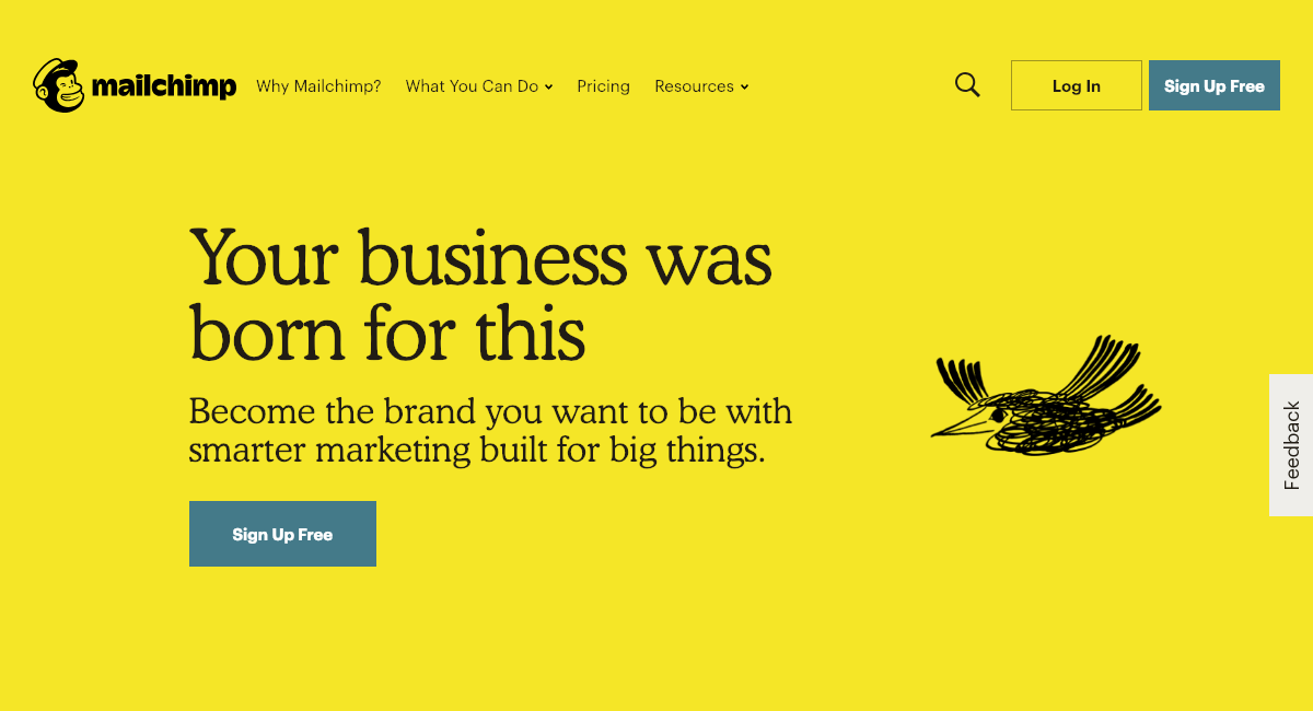
‘Using offbeat humour and a conversational voice, we play with language to bring joy to their work. We prefer the subtle over the noisy, the wry over the farcical. We don’t take ourselves too seriously.’
This quote from Mailchimp’s online style guide succinctly expresses the approach the company has taken to differentiate itself from its competitors.
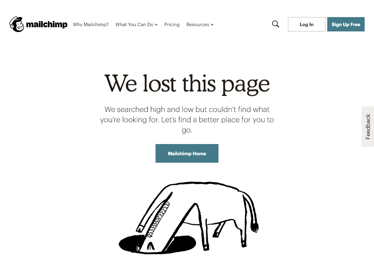
Quirky illustrations (note the lack of photography), an unconventional tone of voice and a strong colour palette with optimal readability (black and yellow) are all deliberate, well-considered techniques to express the brands’ individuality.  Each element of the brand adheres to their mantra from their external marketing to their 404 error page.
Firebox
https://firebox.com/
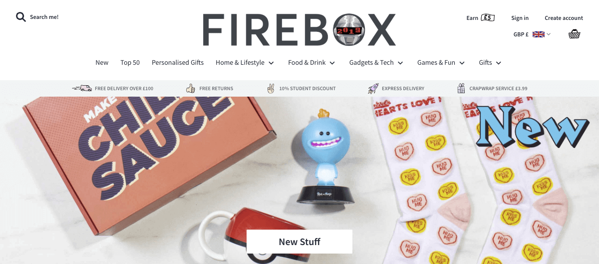
When you search for ‘Firebox’ within Google you immediately gage their brand USP ‘Unusual Gifts for People with Imagination’.
The website itself lives up to the slogan with an array of carefully curated wacky products and humorous illustrations.

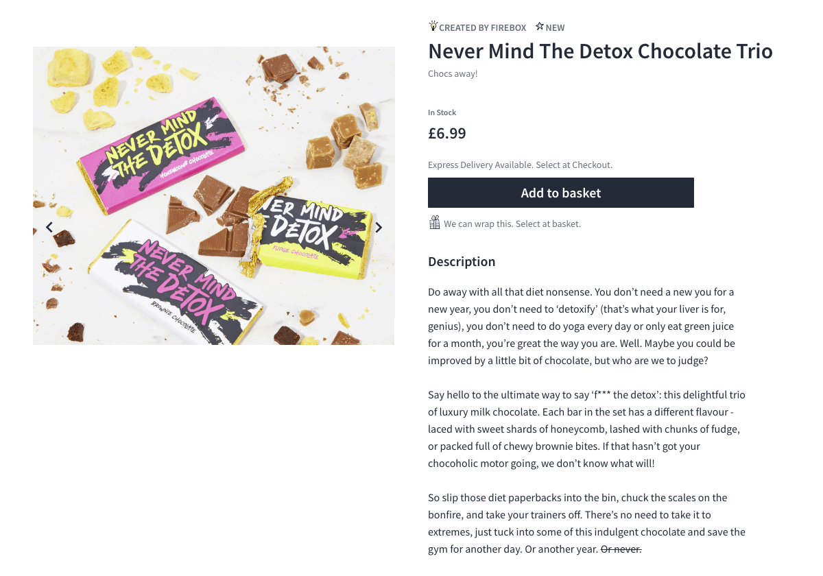
The theme continues throughout the website with the clever, imaginative copywriting found within each item product description and the consideration behind how each product photograph is displayed.
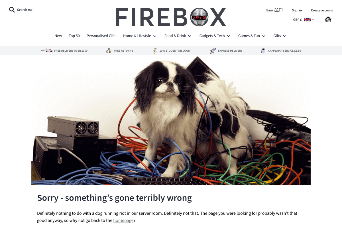
Firebox’s ‘unique’ 404 page.
LINGsCARS
https://www.lingscars.com
‘One of the best websites ever made is for a car-leasing company in England, LINGsCARS. It’s a work of art… and she leases tons of cars’.
— Newsweek
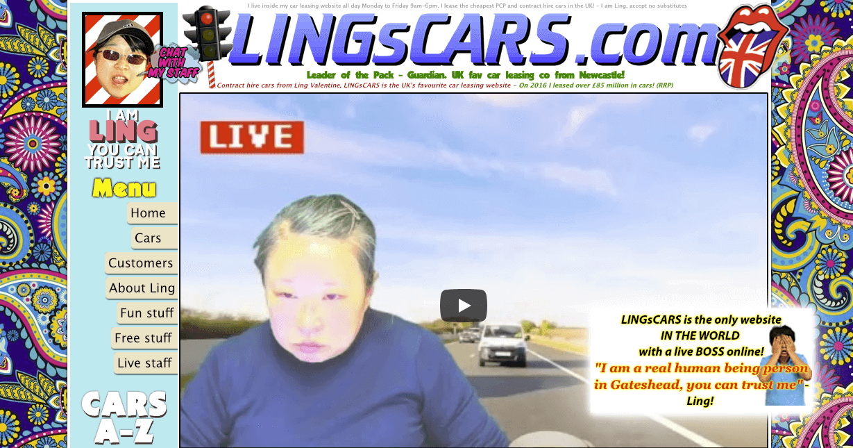
On first sights, you may be thinking to yourself ‘why on earth has this throwback to the 90s been included?’ Well, to know the website is to know the person behind the brand, the one… the only Ling Valentine of BBC ‘Dragon’s Den’ fame.
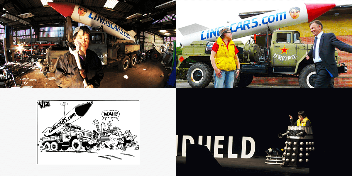
The same zany personality uses an array of deliberate PR stunts to help raise brand awareness of her car leasing business to great effect e.g. her unique advertising vehicle: a nuclear missile truck, her appearance within Viz Comic and her talk at Cardiff’s ‘Handheld Conference’ where she wore a Dalek outfit.
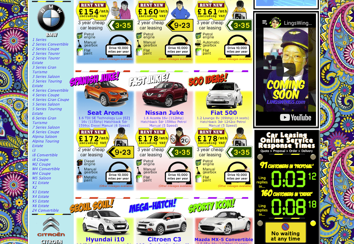
Ling’s website itself truly reflects her brand as it is completely bizarre: garish colours, a mish-mash of typography, an abundance of awful animated gifs and random karaoke performances are just some of the few items you can expect. It may not be to everyone’s taste but it certainly leaves a memorable impression and as a brand it stands out from the crowd, differentiating from her competitors.
If you’re trying to separate your brand from your competitors, WebBox can help. Contact us today.

