1. Data-Driven UX
Your website should be built around the users, not internal opinions. Leverage behavioural insights to inform your design decisions and use continuous testing to improve your website over time. Ensuring that decisions are backed up by data, along with adhering to best practices such as taking a mobile-first approach is critical to the website’s UX. Not sure where to start? Here are the 3 steps that you need to take:
- Define a User-Centered UX Strategy
- Leverage Behavioural Insights
- Prioritise Continuous Improvement
2. Mobile-first Design
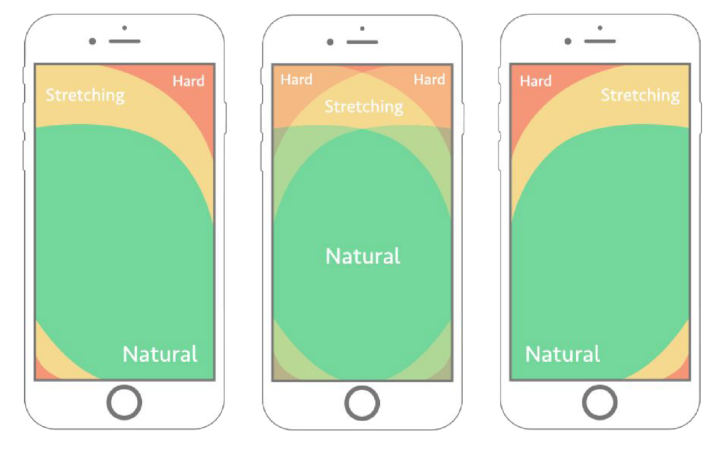
With Google being a mobile-first index, focusing on a thumb-friendly mobile layout is a core part of your site ranking well in search results. Designing with mobile in mind also typically results in a ‘lighter’ website, improving page speed and enhancing user experience. However, this approach isn’t always the best fit for every business, so it’s essential to discuss with your digital agency whether mobile-first design aligns with your goals and audience needs.

3. Micro-Interactions
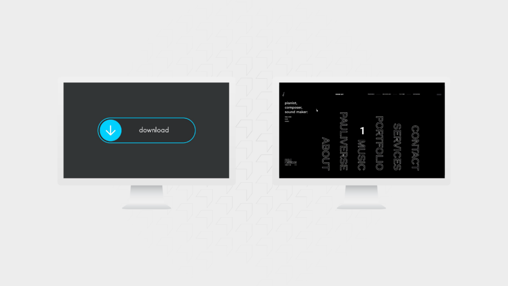
Small animations, hover effects, and dynamic cursors can significantly improve user engagement. What used to be considered gimmicky is now essential to increase the engagement rate on your website. Micro-interactions keep users engaged, add polish to the site, and make it feel more alive, helping users understand that their actions on the site have immediate, visible effects.
In real terms, this could be changing the cursor to a play icon when the user hovers over a video. Then, when the video is playing, the cursor would change to a pause icon. Subtle changes like this will give your users more confidence to engage with your content.

4. True Reflection Design
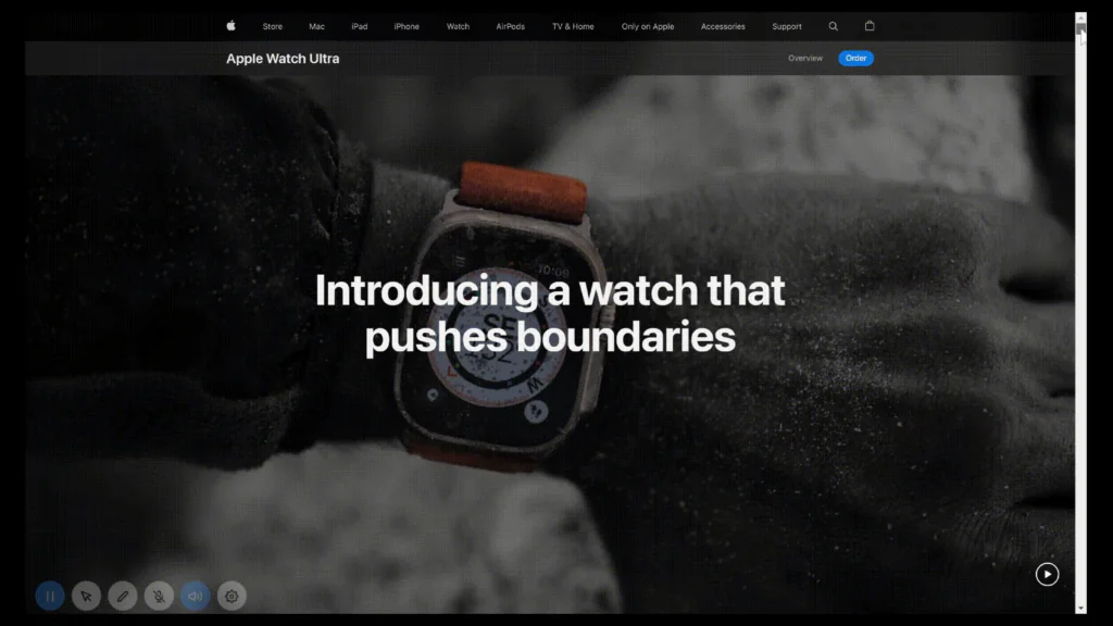
First impressions matter. Your website’s design should reflect, if not elevate, your brand’s position in the market. This requires more than just internal stakeholder opinions; it demands a design strategy that considers how you want to be perceived by your customers. Ensure your design is polished, professional, and truly represents your brand’s value proposition.
5. Dark Mode
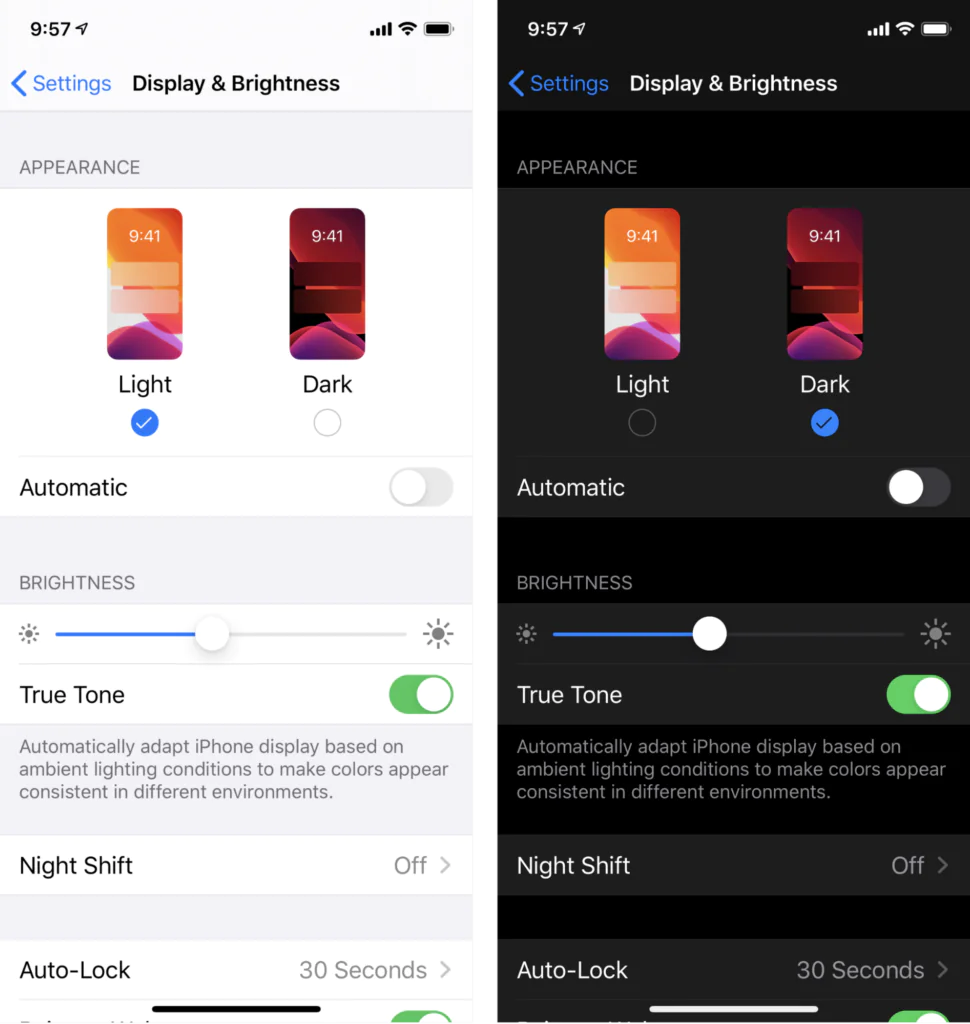
Dark mode isn’t just a trend; it’s becoming an industry standard. Offering this feature enhances accessibility for users who prefer browsing in low-light conditions and reduces eye strain. You can implement it as an optional toggle or automate it based on the user’s system settings or time of day, improving the overall user experience and accessibility of the website.

6. Intuitive Navigation
A website’s navigation is crucial to the user experience, and its design should be tailored to the specific needs of your audience. Let’s break this down into 3 parts:
- Layout: Options like full-page navigation, a header-based menu, or a hamburger icon should be considered based on data and the preferences of your target users. Each layout has its advantages, and the key is to choose the one that best suits the way your audience interacts with your site.
- Hierarchy: When structuring your navigation, prioritise key areas of your business. A common trap during sitemap workshops is assuming that everything is equally important. To avoid overwhelming users, limit the main navigation to top priorities and place less critical content in the footer. Large, cluttered navigations can lead to confusion and a higher bounce rate.
- Content: The language used in your navigation matters. Avoid jargon or terms that may not be familiar to your audience. Clear, intuitive language helps guide users effortlessly through your website and reduces the chances of drop-offs.
Bonus Tip for Service-Based Businesses: Rather than focusing on services, structure your navigation around solutions. Let’s take WebBox as an example, instead of us just listing specific services like CRO or PPC, we highlight the challenges that our audience wants to solve—such as increasing enquiries. This approach is more relatable and helps users identify with the solution, even if they’re unfamiliar with the technical details.

